
As a continuation of my last post, I want to further discuss the concept of mobile search inside of Xamarin.Forms. While search performance is important throughout the search lifecycle, UI responsiveness is essential to a positive user experience.
Initially, when trying to add search to an application, I started with a ListView and an ObservableCollection that would swap items out of the list when a search was run. This proved to be a poor user experience. Items would fade in and out, making it hard to differentiate search results. Additionally, this method did not work well with large datasets.
After reviewing some documentation for iOS and Android, I realized one of the best ways to implement search was to have a “MainView” (or the primary view a user sees when not searching) and a “ResultsView” (to be displayed during a search). Xamarin.Forms does not offer this functionality, so I went about creating it on my own.
Using the UISearchController from iOS as inspiration, I came up with a custom SearchView to solve the issue of properly displaying results. Here is what the view needs to be able to do:
- Use two separate views for the main list and results list.
- This allows for the list of items in the primary view to be cached, so if a user suddenly cancels a search, we don’t have to reload or populate that list again.
- Determine when a search is in progress.
- When the search entry is focused.
- When there is text in the search entry.
- When a search is in progress, transition from the primary view to the results view.
- When a search is cancelled or completed, transition back to the primary view.
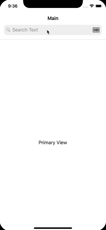
Here are the requirements in action:
In my last post, I discussed how we can use a UISearchBar in a Xamarin.Forms app. Additionally, I created some bindable properties to demonstrate when a search was in progress, or when a user was interacting with the search field. These features come in handy when developing this new custom view.
Creating a custom Search View with the above requirements would make for a lengthy step-by-step tutorial. So, I’m going to post the solution on GitHub and talk through some points that should be highlighted in this post.
- Create a new
ContentViewusing XAML, namedSearchView. - Our
SearchViewis going to have threeBindablePropertys in itpublic static readonly BindableProperty PrimaryViewProperty = BindableProperty.Create(nameof(PrimaryView), typeof(View), typeof(SearchView)); public static readonly BindableProperty ResultsViewProperty = BindableProperty.Create(nameof(ResultsView), typeof(View), typeof(SearchView)); public static readonly BindableProperty SearchEntryProperty = BindableProperty.Create(nameof(SearchEntry), typeof(ISearchEntry), typeof(SearchView)); public View PrimaryView { get => (View)this.GetValue(PrimaryViewProperty); set => this.SetValue(PrimaryViewProperty, value); } public View ResultsView { get => (View)this.GetValue(ResultsViewProperty); set => this.SetValue(ResultsViewProperty, value); } public ISearchEntry SearchEntry { get => (ISearchEntry)this.GetValue(SearchEntryProperty); set => this.SetValue(SearchEntryProperty, value); }
The first two properties should be pretty straight forward, but the SearchEntry is so that our SearchView can determine when a search is in progress and when it should display the PrimaryView or the ResultsView. Except for the constructor of the class, this is the entire .cs file for the view. This file is simple, because we are able to do most of the heavy lifting in XAML. More on how this works in the notes below.
The SearchView is composed of a Grid with two other ContentViews in it. One for the primary view, and one for the results view. We use a Grid because without any row or column definitions, these two ContentViews will lay over each other. So when we need to display one, we fade it in and fade out the other.
In order to display the ContentView of our BindableProperty we give our SearchView a name using x:Name="SearchLayoutView" in the declaration of SearchView, and reference it in each child ContentView. To do so we use the following line: Content="{Binding PrimaryView, Source={x:Reference SearchLayoutView}}"
For clarification, this is what I am talking about:
<ContentView
    xmlns="http://xamarin.com/schemas/2014/forms"
    xmlns:x="http://schemas.microsoft.com/winfx/2009/xaml"
    x:Class="SearchApp.Components.Controls.SearchView"
    xmlns:converters="clr-namespace:SearchApp.Components.Converters"
    xmlns:animations="clr-namespace:Xamanimation;assembly=Xamanimation"
    x:Name="SearchLayoutView">
    ...
    <ContentView
        x:Name="PrimaryContentView"
        Content="{Binding PrimaryView, Source={x:Reference SearchLayoutView}}"
        VerticalOptions="FillAndExpand"
        HorizontalOptions="FillAndExpand"
        Opacity="1">
    ...
- Now that we have the content of our views set, we need to determine when to display each one. We can do this using
DataTriggers. We want our trigger fired whenIsSearchActiveon ourISearchEntrychanges.ISearchEntryis an interface so that we can use either aniOSSearchPage(from my previous blog post) or a more traditional Xamarin.FormsSearchBarcontrol (on other platforms) to let us know what to display. In one of my next posts, I will show how we can add functionality to the standard XamarinSearchBarcontrol to achieve the same functionality that we have in theiOSSearchPage.
Here is what the DataTrigger looks like:
<DataTrigger
    TargetType="ContentView"
    Binding="{Binding Source={x:Reference SearchLayoutView}, Path=SearchEntry.IsSearchActive}"
    Value="False">
    <DataTrigger.EnterActions>
        <animations:BeginAnimation Animation="{StaticResource PrimaryFadeIn}" />
    </DataTrigger.EnterActions>
    <DataTrigger.ExitActions>
        <animations:BeginAnimation Animation="{StaticResource PrimaryFadeOut}" />
    </DataTrigger.ExitActions>
</DataTrigger>
We use the EnterActions and ExitActions to run the animation, which will fade the view in and out. The triggers for each ContentView is just an inverse of the other.
We also have some additional triggers, and a converter, to set IsVisible based on the Opacity. This is because the Opacity is set by the animation, and we don’t want to disable a view until the Opacity is actually zero.
<Trigger
    TargetType="ContentView"
    Property="Opacity"
    Value="0">
    <Setter Property="IsVisible" Value="False" />
</Trigger>
<DataTrigger
    TargetType="ContentView"
    Binding="{Binding Source={x:Reference PrimaryContentView}, Path=Opacity, Converter={StaticResource GreaterThanZeroConverter}}"
    Value="True">
    <Setter Property="IsVisible" Value="True" />
</DataTrigger>
For the animations part, I am using Xamanimation by Javier Suárez Ruiz. This is a great library which allows you to declare animations in XAML.
Our animations are pretty simple. Just a Fade In and Fade Out action for both the primary view and the results view:
<animations:FadeToAnimation
    x:Key="PrimaryFadeIn"
    Duration="200"
    Opacity="1"
    Target="{x:Reference PrimaryContentView}" />

<animations:FadeToAnimation
    x:Key="PrimaryFadeOut"
    Duration="200"
    Opacity="0"
    Target="{x:Reference PrimaryContentView}" />

<animations:FadeToAnimation
    x:Key="ResultsFadeIn"
    Duration="200"
    Opacity="1"
    Target="{x:Reference ResultsContentView}" />

<animations:FadeToAnimation
    x:Key="ResultsFadeOut"
    Duration="200"
    Opacity="0"
    Target="{x:Reference ResultsContentView}" />
And for the actual primary and results view we just have labels, but this could be anything. In fact, if you want to handle your own animations in the individual views, you could bind to the search status in the SearchView like so: {Binding Source={x:Reference MainSearchPage}, Path=SearchEntry.IsSearchFocused}
<controls:SearchView SearchEntry="{x:Reference MainSearchPage}">
    <controls:SearchView.PrimaryView>
        <Label
            Text="Primary View"
            HorizontalOptions="Center"
            VerticalOptions="CenterAndExpand" />
    </controls:SearchView.PrimaryView>
    <controls:SearchView.ResultsView>
        <Label
            Text="Results View"
            HorizontalOptions="Center"
            VerticalOptions="CenterAndExpand" />
    </controls:SearchView.ResultsView>
</controls:SearchView>
While there are a few different concepts floating around here, overall the view is pretty simple. I hope this helps for those of you that have a need for search in your Xamarin.Forms apps. Please see the full sample app here.
Please let me know if you have any questions @jtaubensee!